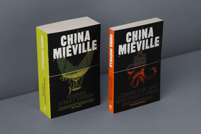
China Mieville novel covers by Crush Creative
I’ve recently read my first China Mieville novel. I picked up a copy of Embassytown in Waterstones and although I liked the universe and was intrigued by the characters I found it not particularly easy to read. I think a combination of the style of writing (it felt very much into the concept of writing/language within that universe – all a bit alien) and the rather slow burning nature of it.
Embassytown did not put me off. I’ve just read The City & The City directly after finishing Embassytown and found it a very exciting read. Much faster and accessible in my opinion. A weird concept of two overlapping Cities existing in two different realities but with gaps in between them where the residents of either city can see the other but must consciously unsee them or be in Breach of the law. I’d buy future novels written within the The City & The City without hesitation.
The main reason for buying Embassytown in the first place was the cover. I’d not heard of China before. It was purely down to the cover illustration and strong Pantone with the nice spot/matt finish. I did read the jacket and seeing the quotes from reviewers and award nominations did help. Having read the book I then looked up the cover designer and it’s a small agency in Brighton called Crush Creative. They do some very nice illustration work.
